
Friday 1 April 2011
Movement of posts
To make my blog organised i have moved my posts and adjusted the dates so that they are in order making it easier to navigate and making it easier for the audience to read rather than searching for the appropriate page they would like to read.
Thursday 31 March 2011

Sunday 27 March 2011
Evaluation Question 1
In what ways does your media product use, develop or challenge forms and conventions of real media products?
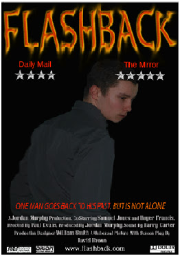
The title of the film which i have created is FLASHBACK i felt this name was suitable as the man charecter has flashbacks from previous experiences and his troubled past comes back to haunt him, this therefore would be a name that would be a good depiction of the film i was looking to create.
For my location one of my classmates offered to let me film in their house which is a large 17th century mansion which was a very suitbale location which would look similar to the abandoned hotel which i had looking to use however i could not find one therefore this was the only option for me.
Costumes and props were a small task which i had to overcome, firstly i had thought about buying clothes for the film however i found peices of clothing that would be suitbale for the shoot and therefore used them and changed them slightly so that it looked more realistic. In terms of props i hardly used any, however i placed things like pictures into it so that it looked a little bit more realistic and so that it did not look like we had just created a scene.
Camerawork and editing were the main peices that i had to work on. In terms of camera work i filmed it whilst two class mates would feature in the main roles, this was an organised process which aloud us to get the filming done quickly and move onto the more demanding editing. In terms of editing i used Coral video studio which is an editing software, initially i had to learn how to edit however following this i found the editing process alot easier however i had to edit a large number of shots which was a timely process.
Title font and style were created on Adobe Photoshop were i played around with different edits on different fonts until i found a combination that i felt worked well and i used this for my magazine cover and poster however i was unable to transfer it across to the editing software for the film therefore i had to create another one on coral. In terms of the main fonts for all the texts i used the same throughout being Lucida Fax but on the poster for the credits i used a different font which followed the conventions of a typical poster.
Genre and how the opening suggests it was hard to create however i done it by firstly using a caption "One Man" this sets the tone for the rest of the trailer as it is a very different caption that wouldnt really be used for a comedy film.
How characters are introduced varys i do not really have an introduction for each i tend just to introduce them into the shots whilst they are acting as part of the real film, however for stephen the introduction would be him discovering the area around him and acting as though he had been there before.
In terms of using, developing and challenging the conventions of a magazine cover or poster i would say rather than challenging them i stuck to using them as in my poster i used the same layout and fonts as a typical poster would have and magazine cover i used many similar conventions but altered some so that they were unique to my magazine giving me a USP(unique selling point) I stuck with the mastheads being the same and dates prices barcodes being in the same position but instead of having very little gaps i had one large dark space so that it looks as though the main charecter stephen is looking into the darkness, or the unknown giving a sense of anticipation.

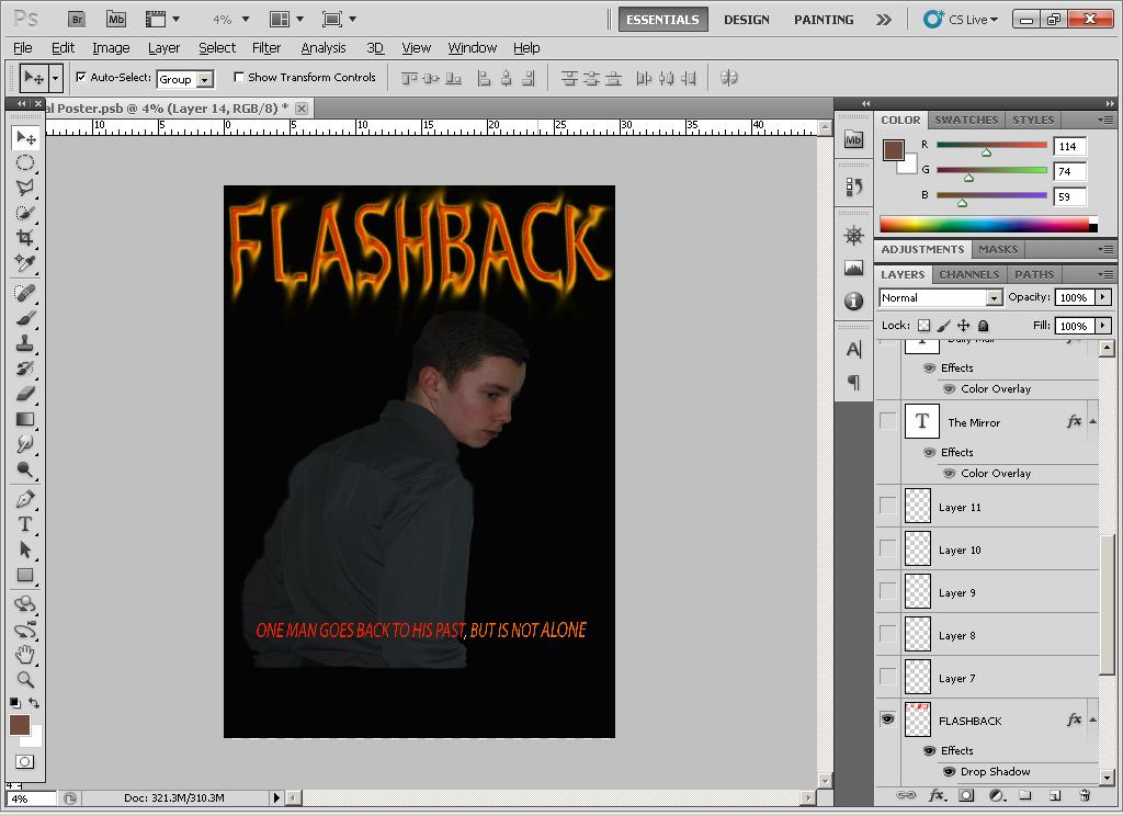
Above are my nine images which i feel depict my film in the best light starting with the title telling you what the film is, followed by the location of the film being a freinds large house, i then have an image of the killer in the dark so that his face cannot be seen, i then have the image which i used for the front of my magazine and for the poster, i also have a little teaser for when it will start, i then return to the killer, followed by the main charecter assessing the surroundings, i then have the punchline "revists a past life" followed by one last image that is shown at the start of the trailer to show that it is genuine.
Saturday 26 March 2011
Evaluation Question 2
How effective is the combination of your main product and ancillary texts?
The combination of my main product being the teaser trailer and the ancillary texts being a magazine cover and a movie poster gel together very well, i feel that i have used a good combination in all three to show similarities so that when the audience look at all three products they can tell what film it is linked to and they can easily understand what the film is about its genre etc.
I feel that my teaser trailer is the key to the success of the other two peices if the trailer is a success then the magazine cover and poster will look after themselves therefore i spent large amounts of time working on them so that they were of such a good standard that they get very good viewing audiences. This therefore meant making it valuable to all audiences which meant i would have to incorporate the preferences of different potential customers and this meant carrying out research and apapting the trailer accordingly.

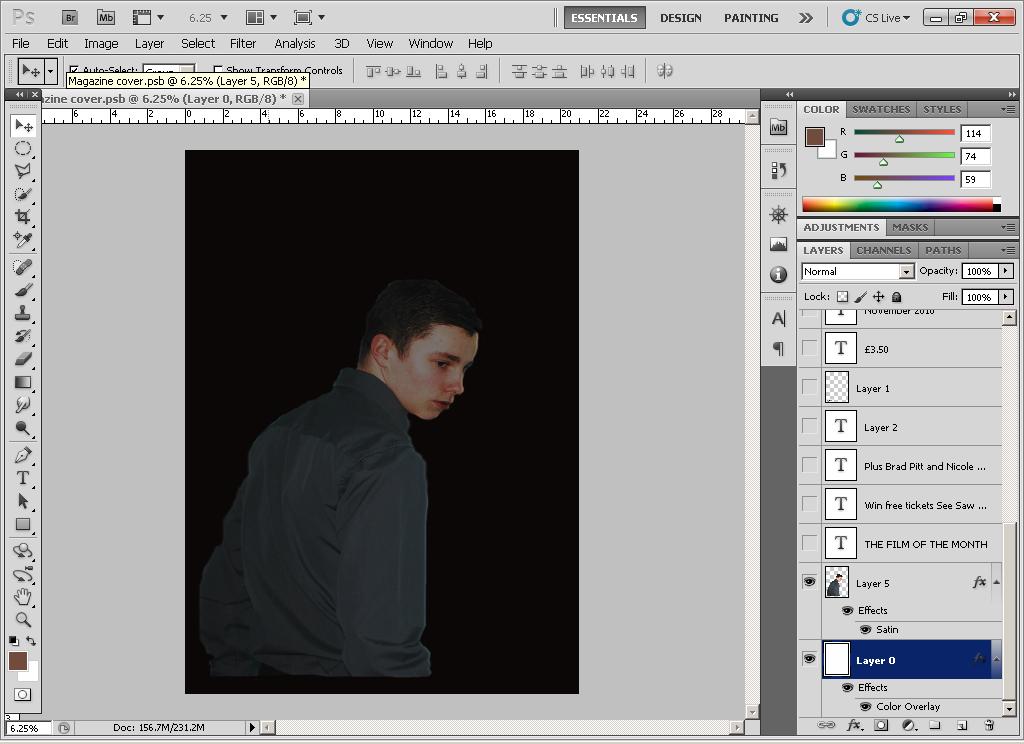
Above are my ancillary texts which are the final peices however they are not in the best quality due to issues of transfering JPEGs in school. However i feel that they are a good reflection of what the film is about and they are produced in a way that can eb very eye catching and therefore attract the customers to want to learn more about the film itself and therefore go through the promotional channles of next watching the trailer and then film. I feel together with the film both peices are of good quality and give a good representation of the film and allow for the customers to learn more when they watch the film rather than just supplying them with the plot in the trailer.
I feel there could be slight changes to the peices for example changing the picture on them so that people can see other aspects of the film however being a small production i need just one image so that people can see this image and instively know that the image has come from the film flashback as the remember it from the film poster or a horror magazine that they had read. However with a film such as saw people will instinctively know the face of the clown as they had seen it many times before in the films so they would be able to use different images to attract the custom.
I tried to portray stephen in the magazine cover and poster shot as though he had heard an abnormal noise behind him and took the shot of him as he looked round to assess the situation. I feel this links well with the trailer as in the trailer we see the murderer running around behind him trying to creep up on stephen getting closer and closer as the film moves on. Therefore the main image for these pages reflects that at one of these points he hears the murderer but wont be able to see him as he would have run into one of the rooms behind him.
The combination of my main product being the teaser trailer and the ancillary texts being a magazine cover and a movie poster gel together very well, i feel that i have used a good combination in all three to show similarities so that when the audience look at all three products they can tell what film it is linked to and they can easily understand what the film is about its genre etc.
I feel that my teaser trailer is the key to the success of the other two peices if the trailer is a success then the magazine cover and poster will look after themselves therefore i spent large amounts of time working on them so that they were of such a good standard that they get very good viewing audiences. This therefore meant making it valuable to all audiences which meant i would have to incorporate the preferences of different potential customers and this meant carrying out research and apapting the trailer accordingly.

Above are my ancillary texts which are the final peices however they are not in the best quality due to issues of transfering JPEGs in school. However i feel that they are a good reflection of what the film is about and they are produced in a way that can eb very eye catching and therefore attract the customers to want to learn more about the film itself and therefore go through the promotional channles of next watching the trailer and then film. I feel together with the film both peices are of good quality and give a good representation of the film and allow for the customers to learn more when they watch the film rather than just supplying them with the plot in the trailer.
I feel there could be slight changes to the peices for example changing the picture on them so that people can see other aspects of the film however being a small production i need just one image so that people can see this image and instively know that the image has come from the film flashback as the remember it from the film poster or a horror magazine that they had read. However with a film such as saw people will instinctively know the face of the clown as they had seen it many times before in the films so they would be able to use different images to attract the custom.
I tried to portray stephen in the magazine cover and poster shot as though he had heard an abnormal noise behind him and took the shot of him as he looked round to assess the situation. I feel this links well with the trailer as in the trailer we see the murderer running around behind him trying to creep up on stephen getting closer and closer as the film moves on. Therefore the main image for these pages reflects that at one of these points he hears the murderer but wont be able to see him as he would have run into one of the rooms behind him.
Friday 25 March 2011
Evaluation Question 3
What have you learned from your audience feedback?
For me audience feedback has been a great help in understanding what i have done well and where i havent succeeded as much this therefore allows me to adapt my work so that i can acheive the best results possible and this was hard to acheive without hearing the opinions of my potential final customers therefore they have aided in the creation of the three peices.
Not only did they assess my trailer but they also gave me help in creating the magazine cover and poster and told me what they felt looked good, appealing and what they felt could be adapted to make it that much more successful for the future.
Below are the results of my questionairre:
What do you think about the magazine cover?
What do you feel about it compared to a market leader such as Empire?
The responeses included :
"i feel that it is a different magazine cover that varies largely from those already in the market and targets a niche in the market"
"It is very well designed and has good qualities and is very easy to look at i would definatley buy it"
"i feel compared to a market leader it is not quite there yet, but that is obvious as it has only just been created over time with more knowledge and materials available i feel it has good potential"
- What do you think of the film poster in terms of a horror film?
- If walking past this poster would it catch your eye enough to stop and take interest?
I asked these questions to the group as a whole and asked them to discuss it together while i sit out and write notes about what is being discussed. Initially they began talking about the film poster compared to other horrors.
" Compared to horrors such as Saw i would say that it is not in the same league, however we cannot compare it to that due to the large scale and funds they have available therefore i feel for a small budget piece it is very good and an eye catching piece."
"For me i do not feel it has enough horror about it to scare an audience and catch the eye, however to do this i feel all that needs doing is going against the conventions and have the man with the murderer in the background rather than him alone."
"I feel for a small budget it has been well worked and gives the impression the character is looking into the dark with little knowledge of his surroundings and is a good piece"
- If you were to see this teaser trailer, would you be enticed to go and see the film itself?
The group had this discussion for roughly 5 minutes and some of the results which were found included:
- "Its a very insightful and typical horror film, but for me to see it, i feel it needs more gore and blood as the trailer did not fulfil this."
- "Really enjoyed the trailer thought the song was perfect for the trailer and the captions suited the film"
- "From first look i probably wouldn’t see it however from reading the storyline i would definitely enjoy this type of film as it is one of the characteristics i enjoy"
As shown above i asked a number of questions and got a wide range of answers which was good as it allowed me to understand what i could change and so that i could make my peices as good as possible. I also found it useful as many of the people i asked would be those who would see the film not those who would just look at the piece and have little understanding of the genre. I asked a wide range of people therefore my results gave a wide range of answers which was better than a small number as it gave me more scope to change and therefore better my work rather than just 5 peoples opinions as this may be biased whereas with 25 people there is less chance of pupil bias.
Thursday 24 March 2011
Evaluation Question 4
How did you use new media technologies in the construction and research, planning and evaluation stages?
For my production of the film trailer i used vast amounts of media technologies, firstly i used a camcorder to record the trailer itself as shown in the hardware used section it describes the camcorder used. Secondly i used Coral Video Studio which is the film editing software which we used to bring the trailer itself together this was a very useful technology for me.
For the other to peices i used a digital camera which is also described in the hardware used post and i used adobe photoshop for both magazine cover and poster which was very helpful in the creation of both peices.
I have collated a number of images of all the peices of software that i have used in the process of creating my media peices. I have included in this the two peices i used to create the tasks photoshop and coral video studio, but i also included all the peices of software that helped me through this process such as youtube google soundcloud and adobe indesign.

Continually throughout my production i have used different media technologies to support my work so that i could make it the best standard possible. The use of computers and the software is easy to use and allows work to be much easier and more professional.
For my reaserch i would be constantly on youtube looking at trailers and also on google going through film posters and magazine covers picking out the conventions looking at what works well and what i felt i could integrate into my peice. The use of google and youtube were very helpful for me as it was easy to find what i wanted to look at and therefore i could find it instantly and then write down my notes on what would be going in to my peices.
For the construction programmes such as photoshop, coral and indesign were integral to the creation of my film and the ancillary texts. Coral was the programme i used to make my film trailer, however it is not the easiest peice of software to get used to as we had only a limited amount of practise with the software however i looked at videos of the programme and worked out the best ways of editing and how to create titles. This was key for me getting to grips with the programme and making a successful teaser trailer. I then used photoshop to put my magazine cover and poster together. Following all my reaserch i had drawn sketches of what i wanted the two peices to look like and made sure i knew exactly what i needed to do with the software. As i had used photoshop previous i had a good idea of what i was doing so that had little relevance. I worked with indesign for text peices so that they are all the correct sizes and have the same font etc. As with photoshop it is not the best for text peices better for making the images look lifelike therefore with the use of indesign i felt more confidence about the texts and it made me feel more happy about the peices i had created.
For my planning i used technologies such as cameras and computers with the internet so that i could take pictures of peices which i felt would go well with my theme and look at similar peices online so i knew what mine would look like and wether the genre i had chosen was easy to depict. As a result i found it very useful and my planning was a success as i had a good idea of what i wanted to do and knew that the horror genre would be the way for me to go as i could depict it very easily.
Wednesday 23 March 2011
Evaluation Questions
We have been set 4 evaluation questions which can be carried out in any format from video to written through the blog. I am going to look at using different types of media to publish my evaluation points. The questions we have been set are:
1. In what ways does your media product use, develop or challenge forms and conventions of real media products?
For this question i am going to be looking at how my magazine compares to current magazines and how i have copied some conventions but changed some so that my magazine has a unique selling point.
2. How effective is the combination of your main product and ancillary texts?
For this question i am going to look at my trailer, magazine cover and poster compared to thos currently on the market to see where i differ from the huge success' and where i could adjust to compete with the large corporations.
3. What have you learned from your audience feedback?
For this i am going to evaluate my user feedback and contruct a plan that could be put in place so that the audience feedback can be used to improve the quality of future peices and how it helps me to understand my peices more effectively.
4.How did you use new media technologies in the construction and research, planning and evaluation stages?
For this question i am going to look at all the new media technologies i have used along the process and evaluate how they have helped in all three stages and how they have improved the process and how effective they have been.
For all these peices i will create a seperate post for each and look to use different types of media to compare and evaluate all sides of my media production.
Sunday 27 February 2011
Aims Of The Production
For my A2 Media Coursework i have to create a teaser trailer, a poster to go with the film and a magazine cover of a related magazine that all incorporate the same theme and genre as if i were to be marketing a real life film. I decided to choose the horror genre as i felt this would be a fun film genre to do and their is a large amount of scope available when creating a horror film. Before i started any of my work i felt i would have to do research on all of the items that i would be making so that i knew their backgrounds and so that i can identify all of the conventions, as shown in the blog below i have made it so that they are in chronological order of what i done and when i done them so that when i am creating the peices i can relate back to my previous notes and from their be able to understand what i am trying to make and so that i can create it to the best of my ability so that it can withstand the competition of the modern day film industry.
I already had an interest in horror films before taking on this peice of work therefore i felt comfortable being able make a good peice for my coursework and make it work so that it would dipict the conventions of a typical horror magazine, poster, trailer as i have great knowledge of all aspects previously. i felt this was very helpful and gave me extra impitous so that i could make the magazine to the best possible standard.
Below i found some posters initially of what i wanted my films to be like and have added them to the blog to give an idea of what i am aiming to acheive. I am choosing to make my poster and magazine first and then spend the large proportion of time on my trailer as i feel this will be the hardest part of my film to make strong and appealling to my target market. These are two very different posters and i chose them as for mine i would be looking to compile both aspects into the one peice so that it had many different aspects and would give the potential audience a great amount of knowledge about the film.


Storyline
My film is called FLASHBACK and is a film in the horror genre. The film is about a man who has died and is now in a second life. However he revisits his previous life and where he used to live, with it being a horror film however there is always a side issue which takes place. In this film that is a murderer who has also died but has been possessed by the devil, he has a face which is covered in scars and wears all dark clothing as he only appears at night and therefore cannot be seen with his dark clothing. However the main subject in my film starts of during the light hours and is discovering that he has been to the house before, however as the trailer proceeds we see snippits of the murderer in flashes, with the shots being flashes the audience does not get a full shot of the murderer so they have something to look forward too however at the end of the trailer we have a close up of the murderer with his eyes outstanding but this shot is very quick but is delivered with a large sound preferably a scream so that this stands out to the audience and gives them something to remember.


Process of Production - Film Poster
Below are screengrabs from my production of my film poster and how i started and got to a finished peice rather than just showing the finished project i am going to talk through the whole process.

Firstly i had a blank page which i gave a black background to and inserted the image onto the page and made the adjustments to the images so that it blends well with the background and does not look out of place in the centre of the page. I chose this specific image as i felt it depicts stephen the main charecter looking over his shoulder into darkness not knowing what could be behind him.
Following the first process i added the title and the slogan to the page making the title distinctive so that it stands out largely from most of the page. I chose it to be orange and resembling fire as it is very vivid and stands out, also i chose it to be smudged slightly so that it gives it an edge rather than being plain and not appealing to a horror genre. For the slogan i used red and orange to differentiate between 'not alone' and goes 'back to his past.'

Following making the title and slogan i added stars and paper names so that the film has been given a rating by papers, i done this so that i was following the conventions of a typical film poster and the poster also contained relevant professionalism.

To finish of the peice and make it as professional as possible i added the credits to the bottom of the page to follow the convetions and i also added company names as all the posters i looked at when planning contained these and therefore i felt that my poster would have to be the same.
Process of Production - Magazine Cover
Below is the production process of my magazine cover talking about the whole process of making the magazine cover and all of what i had done to make it and all of the fonts and colours involved and why i chose them.
For my magazine cover i used the same image as i had used for my film poster as i felt the customers would be able to instinctively tell which film the image was from therefore staying in their long term memory, i also chose the black background as it is a fairly mellow colour which flows well with most colours.


Following this i added all the information to the page e.g. tickets to movie premiers as this is another convention of movie magazines therefore i felt it would look professional if i included it aswell. I used red font for this as red is reminicent of horror genre rather than being a colour such as blue.

I then added the strapline Uks most succesful horror magazine as a promotional method of attracting horror fans, and i included the slogan 'the film that comes with a twist' so that it adds to the film and makes it more interesting to the potential audience.

Finally i added the name of the film FLASHBACK and i used the same font as i had used in the poster so that when the audience sees the magazine they will instantly recognise the name flashback and be intrigued into purchasing the magazine.
Student Poster Analysis
https://blogger.googleusercontent.com/img/b/R29vZ2xl/AVvXsEi59blg6FaClMb2QoKvoTkQ8-unNgwXegLjTI5LkojN6HEbeS6P4dj65GXUOrB8NJwkLGTlJajLuWzs5G5XJzYOWKZTW3l41WbitoHYWZenBAOF9pXafl-8zWavu9Ar3jTyoRCo8yzQ7wEv/s1600/film+poster+final.bmp
Above is the image of another students movie poster which she has created for A2 Media, i am looking to analyse it and say where she could have changed and any of her poster which i could use in my own poster.
The strengths of this poster in my opinion would be that the main image is of good proportion so that it dominates the page and allows the audience to catch a glimpse of what i see as the main charecter. I also feel that the main title is very positive as it looks appealing and most of all professional which is key to this peice. However i also feel that the Dolby Digital image is not very appealing and i feel that it has very little relevance, therefore they should look at removing this peice and therefore extending the credits at the bottom as i feel conventionally they have alot more people credited rather than the small number that this candidate has placed. The main problem with this poster is that the title and the image depict very different things, to me the image suggests a woman sitting in a sexual pose however the title depicts someone about to die therefore the match between the two is not very distinct and therefore hard to decide upon the genre that the film would be placed in.
For my peice i would look at using the title as i feel it is very professional and works well with the image which i feel my magazine does not do well enough i feel they are very seperate and therefore takes alot away from the image.
Student Magazine Analysis
https://blogger.googleusercontent.com/img/b/R29vZ2xl/AVvXsEjUXuA5imH2cdAiUUOQaLGJ_iQdTATWXKtgxan6vCRIH5Lfm6rdOeuK8lA3zDlUabaw7g_SOUNCZViX8JGBB6ZtVuEVcN_FvJi6Mh7QF8rDgkvudOhISSJGFFaSk_ztV5RFKe7qnnGIjXOC/s1600/front+cover+final.bmp
Above is a link to a students magazine which i aim going to analyse and compare to my own and see what i could have changed and what i could do differently.
Firstly i feel that this magazine follows most of the conventions of a typical magazine cover but i beleive that it is nowhere near the standard that i feel it should be at. My initial thoughts were about the image, and how it is a very pixalated image and the on screen image does not do the magzine much help therefore runining the page as a whole. Secondly i felt that the large purple star took the readers eye away from the important text too much, i felt it should be smaller than it currently is. Apart from these i felt the texts as a whole resembled that of a typical magzine cover and i felt they were formal enough to make it look professional. I also felt the masthead was very conventional of that of magazine covers and it works well with the other text which is placed on the page. The strapline at the very top of the page i felt was also very good and if i were to change mine this would be a possible change that i would make to it.
The other peices i may use from this page would be to move all the important under the masthead e.g. the barcode and website so that when looking at the price the customer will get the rest of the information in the same image.
Student Trailer Analysis
http://www.youtube.com/watch?v=KNtJcTOisS0&feature=player_embedded
Above is a trailer of a student from a previous year who created a horror teaser trailer. On the whole i felt the trailer was exceptional for a small budget perfromance.
I feel the strengths to Brendans blog are that he has very good and sharp edits which make the trailer very watchable and give a good feeling of anticipation. I also felt that the sound clips that he had worked very well with the images on screen and he had collated the images well. However i feel that when the girl in the middle screams it is unrealistic as she does not seem scared enough as i would have expected her to be. This could be a small downfall to the trailer however i feel the overall feeling of the trailer is one that represents horror effectively. I feel this is a very successful trailer and for my trailer i could learn alot in terms of the methods of cutting he uses to make things much quicker on the eye adding to the level of anticipation that builds throughout the trailer. I also feel that if i were to do my trailer again i could use sound clips over the top of the trailer rather than just one theme song throughout as it breaks it up and adds a different dimension to the trailer itself.
Wednesday 23 February 2011
Choice of Genre
There are many genres which i could have chosen to use for my trailer however i can only use the one therefore i evaluated the ones which i like and then chose the one which i felt would be most appropriate for me to use. The genres which i preffered were:
These would be the three most typical film genres that would be used therefore i found examples for each and identified ways i could use them or couldnt.
Firstly the horror genre, now my favourite horror film is friday the 13th so i chose to study this one, therefore i got the trailer from youtube and looked over it to make sure i knew it well and how i could film it.
- Horror
- Action
- Comedy
These would be the three most typical film genres that would be used therefore i found examples for each and identified ways i could use them or couldnt.
Firstly the horror genre, now my favourite horror film is friday the 13th so i chose to study this one, therefore i got the trailer from youtube and looked over it to make sure i knew it well and how i could film it.
With this film it is hard to carry out the same graphics and the fire which goes on however i used the conventions and similarities to analyse whether or not i could do a film like this, i felt that i would be able to carry out a horror film as the conventions are typically darkness gore blood. These can easily be portrayed but may be hard to portray them well.
The next genre is action now this is typically car chases or lots of fighting so at first thoughts i felt i may not be able to film it however i looked at the trailer of the new A team to see how its set out and wether or not i would be able to do it.
When looking at the trailer i felt i would not have resources to film a trailer like this for example the police chase would be hard to incorporate or any chase for that matter this therefore dented the chances of making a film like this, also the use of guns would be hard to film and hard to make look realistic therefore the chances of carrying out an action film were not at all great.
The third genre i have chose is comedy now for this i looked at The Grown Ups this is one of latest comedy films and felt it would be a good film to evaluate.
Comedy is very hard to copy as it is hard to translate the comedy to the audience therefore i felt it would be hard to portray the comedy well, so i evaluated grown ups and felt the way they portrayed comedy was ingenius and the actors were of such good quality that they brought the comedy to the audience very well so therefore i felt it was not possible to carry out comedy and would have to be one of the other genres.
Therefore by looking at all 3 genres i assesed that it would be difficult to make a successful comedy trailer as you would have to create peices of comedy in such a small time which can be hard for an amateur production, also for the action genre i felt it would be hard to incorporate the car chases and the shooting without it looking too obvious that it had been edited. So therefore i chose to go for the horror genre as i felt that i would be able to make a trailer magazine cover and poster that depicted the conventions of these peices well and would be an enjoyable process doing it.
Monday 14 February 2011
Hardware Involved
When creating a movie trailer and ancillary products such as a magzine cover and a film poster any A2 media student would require the same as myself.


 Firstly we have used a Nikon D60 camera to take the images i require for my magazine cover and poster we used this make of camera as it is one of the best on the market for medium to close up images and has one of the best reputations as an easy camera to use.
- Secondly we required a video camera to film the trailer itself, for this we used a panasonic S50 these are not the best video cameras you can get but they provide the quality required to make a succesful A level medi production, they are also very easy to use and do not require much knowledge to use.
- For the first two peices of hardware we required tripods so that the filming would not contain any shakes from the hand, therefore we use tripods with three sturdy legs so that they do not wobble in the wind giving the best possible film quality. This may not be classed as hardware but was an integral part in making the filming a success.
- We most importantly need a computer which has the software required and is a good computer with a reknowed reputation for film creation, at this moment in time the best option would be the apple mac however we did not have this at our disposal therefore we use a HP L1940T these are one of the best computers around for medi creation and have a very fast running speed therefore saving and other issues are dealt with easily.
The final peice of hardware i required was a printer so that i could view the different peices i created before making a final decision on wether or not i felt the magazine or poster was complete. (HP Officejet Pro K850)


Sunday 13 February 2011
Audience Research
When creating a horror film the audience will typically be above 18 as most horror films have a rating of 18 and therefore it cannot be viewed by anyone younger. When creating a film it is key that you establish who you are aiming your film at so that you know how you are going to market your product and where you are going to promote it. Therefore i need to carry this out as for my ancillary products i am creating a magazine cover and poster which are both methods of production. I initially wanted to aim this at the 18 to 25 year old population but from user feedback early on i established that i could aim at a wider market therefore i am now aiming at the 18 to 30 year old market which therefore means advertising slightly more maturely and in differing place however this did not have a huge impact. When i had established my target audience i knew what i had to create and from there it was not too hard to establish what i had to create. However it does not just have to appeal to this market it can also be appreciated by other age groups and does not jus have to be subject to the target audience.
For example toy story would be aimed at children up to the age of 15/16 but may appeal to the elder population aswell.
For example toy story would be aimed at children up to the age of 15/16 but may appeal to the elder population aswell.

Theme Song Choice
When making a successful trailer it is good to have a theme tune that will stick in the memory of the target audience and will be a very significant song that attracts the audience of the given genre. Seeing as i would be in the horror genre i felt the song or tune would have to be one that is of little melody and has a distinct feeling to it that make it resemble a horror film. For this i would not have been able to create my own peice as this is very hard for a student with my budget therefore i would have to use a video to mp3 converter and for this i used www.video2mp3.net as my website of choice as this had been suggested by my fellow media studies class. Therefore i had to find an appropriate song and for this i felt the theme tune to nightmare on elm street would be perfect for the film i was trying to create therefore all i had to do was collect the name of the link from youtube post it on the converter website and it would convert within seconds. I then simply saved it to my USB pen and entered it as a file to my trailer. To follow this i had to adapt it so that when a high point in the song came so would a different shot or a caption so that it was matching and therefore did not seem out of sync with the trailer itself. This theme tune was perfect as it was used in a very succesful horror film and would suit the film that i had in mind and could match the filming very effectively.
Below is the video from which i converted to a MP3 file.

Below is the video from which i converted to a MP3 file.

Subscribe to:
Posts (Atom)