
Below is the production process of my magazine cover talking about the whole process of making the magazine cover and all of what i had done to make it and all of the fonts and colours involved and why i chose them.
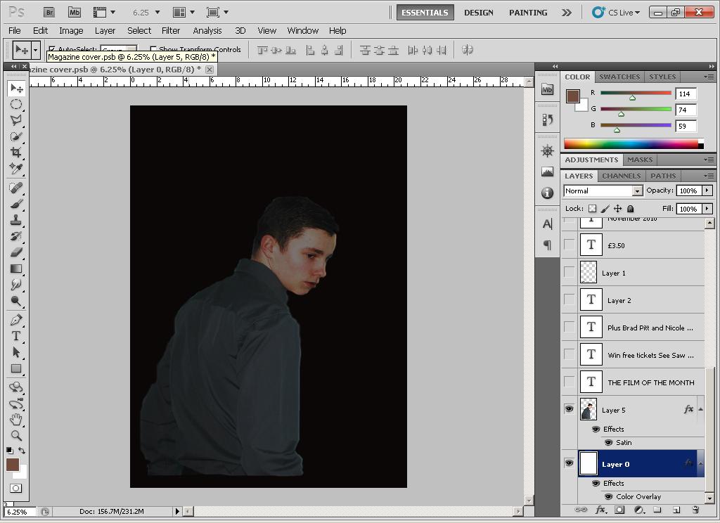
For my magazine cover i used the same image as i had used for my film poster as i felt the customers would be able to instinctively tell which film the image was from therefore staying in their long term memory, i also chose the black background as it is a fairly mellow colour which flows well with most colours.


Following this i added all the information to the page e.g. tickets to movie premiers as this is another convention of movie magazines therefore i felt it would look professional if i included it aswell. I used red font for this as red is reminicent of horror genre rather than being a colour such as blue.

I then added the strapline Uks most succesful horror magazine as a promotional method of attracting horror fans, and i included the slogan 'the film that comes with a twist' so that it adds to the film and makes it more interesting to the potential audience.

Finally i added the name of the film FLASHBACK and i used the same font as i had used in the poster so that when the audience sees the magazine they will instantly recognise the name flashback and be intrigued into purchasing the magazine.
No comments:
Post a Comment